Warby Parker
www.warbyparker.coma calm, trustworthy retail-optometry site that pairs a near-black ink (#121212) with a confident royal blue (#1050D0), runs a custom grotesque against a custom serif, and lets warm lifestyle photography and a fast 0.2s ease carry the polish.
Design tokens
- display
- Ivory LL
- body
- ABC Social
- mono
- none
Do / Don't
Reference it for
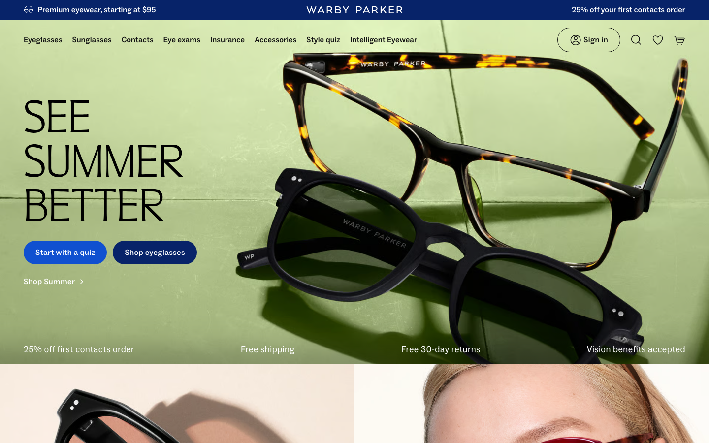
- Retail-service nav that puts booking, insurance and a guided quiz beside product categories, exactly what an optometry or eyewear practice needs surfaced.
- A single royal-blue action colour (#1050D0) on an ink-and-white base, used only for buttons and links so every click target reads instantly.
- The filled-pill plus outline-pill CTA pair, 100px radius, as a clean primary/secondary pattern.
- Trust strips (free shipping, returns, vision benefits accepted) placed directly under the hero to do reassurance before the pitch.
- A custom grotesque (ABC Social) for UI with a serif (Ivory LL) reserved for editorial headlines, a calm, premium pairing.
- A near-invisible 0.2s house transition that makes the whole site feel responsive without any animation library.
Do not copy
- ABC Social and Ivory LL are licensed custom faces; map to an open grotesque plus a warm serif rather than lifting them.
- The exact royal blue and the lifestyle photography are Warby Parker's brand equity; pick the client's own accent and shoot their own faces.
- The third-party stack (Bazaarvoice reviews, Vimeo, freshpaint analytics) is retail-scale plumbing a small practice does not need.
Signature moves
service-first retail nav plus trust strip
the nav surfaces booking, insurance and a guided quiz beside product categories, and a trust strip (free shipping, returns, vision benefits accepted) sits directly under the hero to reassure before the pitch.
single royal-blue on ink-and-white
one royal blue (#1050d0) on a near-black ink (#121212) and white base is used only for buttons and links so every click target reads instantly.
filled-pill plus outline-pill CTA pair
a filled pill and an outline pill at 100px radius form a clean primary/secondary action pair, with a grotesque (ABC Social) for UI and a serif (Ivory LL) reserved for editorial headlines.
Related references

Aesop
flagshipConsumer Brand
an editorial e-commerce reference where Suisse Intl on warm-cream `#fffef2`, a modular 1.13 type ratio, and full-bleed photography do all the work - no display face, no accent colour, no motion of consequence.

Alo Yoga
strongFitness
an aspirational activewear and yoga store that runs almost pure black-on-white, lets full-bleed editorial photography fill the frame, and adds personality through one handwritten-italic serif overlay and disciplined image-grid merchandising.

Bellroy
flagshipRetail
an accessories e-commerce site that fronts a deep catalogue with one bold, punchy hero, leading with heavy uppercase GTUltra type, a warm terracotta accent on a near-monochrome base, and a calm Material-style motion system that keeps a 40-section shop feeling composed.

Core Atelier Pilates
nicheFitness
a warm, editorial pilates-studio site in espresso and cream (#25140C / #F7E7DE) with an Albert Sans plus Minion Pro serif-italic pairing, sun-lit interior photography, Lenis-smoothed scrolling and a giant "core atelier" wordmark closing the page.