Alo Yoga
www.aloyoga.coman aspirational activewear and yoga store that runs almost pure black-on-white, lets full-bleed editorial photography fill the frame, and adds personality through one handwritten-italic serif overlay and disciplined image-grid merchandising.
Design tokens
- display
- proxima-nova italic (editorial overlay)
- body
- proxima-nova
- secondary
- arquitecta (Latinotype)
- mono
- none
Do / Don't
Reference it for
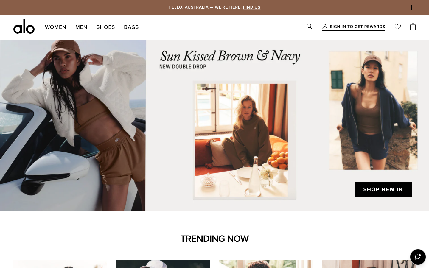
- A yoga / activewear / studio-retail brand wanting an aspirational, image-led feel: near-monochrome chrome, full-bleed lifestyle photography, almost no UI furniture.
- An editorial italic display overlaid on a hero image as the single personality move against an otherwise clean sans system.
- Disciplined merchandising rails: a small uppercase category label, an image grid, a "Shop X" link, repeated as the page rhythm.
- A deeply tokenised neutral system (named greys, a 4-120px spacing scale, shadow levels) that keeps a large Shopify catalogue consistent.
- Light, tasteful motion (0.3s colour, 0.6s transform) that supports rather than performs.
Do not copy
- The "alo" wordmark, the golden-hour brand photography, and proxima-nova / arquitecta are Alo's identity; map to a comparable clean grotesque and source your own lifestyle imagery.
- The Shopify + Builder.io machinery and 182 custom properties are an enterprise retail apparatus; borrow the token discipline, not the volume.
- Pure black-on-white with full-bleed photography only works with consistently styled, professionally shot images.
Signature moves
near-monochrome image-led merchandising
almost pure black-on-white chrome with full-bleed editorial photography filling the frame and almost no UI furniture, depth from a deeply tokenised neutral grey system.
single italic-display overlay personality move
one handwritten-italic serif (proxima-nova italic) overlaid on a hero image is the single personality move against an otherwise clean sans system.
repeated label-grid-link merchandising rail
a small uppercase category label, an image grid and a Shop X link repeat as the page rhythm.
Related references

Aesop
flagshipConsumer Brand
an editorial e-commerce reference where Suisse Intl on warm-cream `#fffef2`, a modular 1.13 type ratio, and full-bleed photography do all the work - no display face, no accent colour, no motion of consequence.

Glossier
flagshipBeauty
a beauty-DTC site stripped to near-nothing, black Apercu on white with millpond whitespace, a famous soft-pink campaign hero, and one electric-blue (#0600FF) accent, where the restraint itself is the brand.

Warby Parker
flagshipHealth
a calm, trustworthy retail-optometry site that pairs a near-black ink (#121212) with a confident royal blue (#1050D0), runs a custom grotesque against a custom serif, and lets warm lifestyle photography and a fast 0.2s ease carry the polish.

Alternative Aesthetics
nicheDesign Portfolio
The reference for solo illustrator portfolios on Webflow - hand-drawn "Stay Strange" hero typography, monochrome black/white canvas, and a 4-column thumbnail grid that lets the artwork carry the entire visual voice.