Tranch
www.tranch.comThe reference for B2B fintech that refuses to look like B2B fintech - sketchbook-style asymmetric-radius cards, hand-drawn cartoon illustrations, pure black borders on white.
Design tokens
- display
- 'Bw Gradual', system-ui, sans-serif
- body
- 'Inter var', ui-sans-serif, system-ui, sans-serif
- mono
- (none on homepage)
Do / Don't
Reference it for
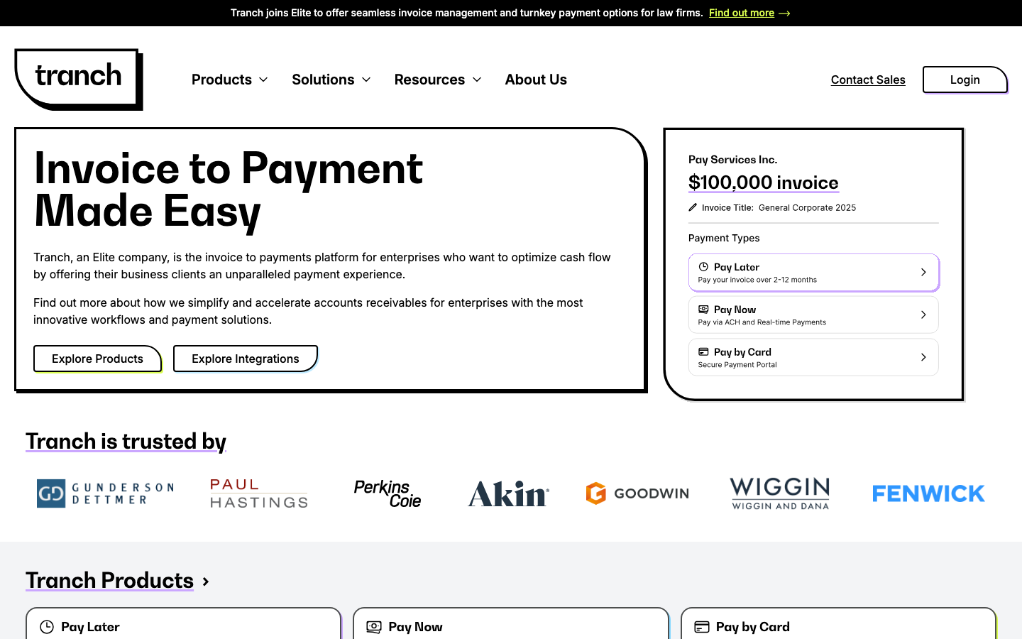
- Asymmetric radius 0px 48px 0px 0px as the card-border signature - appears 7 times in the captured radii inventory
- Thick black borders (~2px) on white cards instead of subtle shadow - distinctive sketchbook feel
- Underlined section H2s ("Tranch is trusted by", "Customer and Partner Testimonials") like textbook chapter headings
- Hand-drawn cartoon illustrations - dollar coin on paper plane, etc. - replaces stock photography or product mockups
- Monochrome palette with two saturated accents (lavender #a973ff + lime #d9fc50) used sparingly
- Bw Gradual display font (paid) paired with Inter Var (free) - rounded-terminal geometric sans
- Logo wall of 7+ AmLaw firms - prestige customer signal for B2B legal-tech
- Dual-tabbed product demo (Pay Later / Pay Now) with detailed invoice mockup
Do not copy
- The Bw Gradual font licence
- The cartoon dollar/paper-plane illustration style - bespoke illustration commission
- The Tranch logotype (custom sketched logo with the asymmetric border applied directly to the wordmark frame)
- The AmLaw firm logos (Gunderson Dettmer, Paul Hastings, etc.) - Tranch-specific customers
- The "Tranch joins Elite" acquisition announcement - brand-specific event
- The lavender + lime accent combination - Tranch-specific brand
Signature moves
asymmetric-radius sketchbook cards
cards carry an asymmetric radius signature (0px 48px 0px 0px, appearing 7 times) with thick ~2px pure-black borders on white instead of shadow, for a hand-drawn sketchbook feel.
underlined textbook section headings
section H2s are underlined like textbook chapter headings, and a quote glyph sits in italic-bracket style inside testimonial cards as editorial punctuation.
hand-drawn illustration over stock
hand-drawn cartoon illustrations (dollar coin on a paper plane) replace stock photography or product mockups, refusing the default B2B-fintech look, with two saturated accents (lavender #a973ff + lime #d9fc50) used sparingly.
Related references

Avantgarde Properties
strongOther
A Dubai luxury real-estate agency that sells status boldly - a near-black canvas, an enormous mixed bold-sans-and-italic-serif display ("Welcome To / Avant Garde Real Estate"), full-bleed property films, a developer-partner logo wall (EMAAR, DAMAC, Nakheel), and copy aimed squarely at "the world's elite".

Bellroy
flagshipRetail
an accessories e-commerce site that fronts a deep catalogue with one bold, punchy hero, leading with heavy uppercase GTUltra type, a warm terracotta accent on a near-monochrome base, and a calm Material-style motion system that keeps a 40-section shop feeling composed.

Euro Design Remodel
strongOther
A Bay Area bathroom/kitchen design-remodel firm that earns trust through a wall of third-party proof - a star-rated testimonials carousel, a full badge row (Houzz, EPA Lead-Safe, BBB, Angie's List, Yelp), financing reassurance and a "100% satisfied" promise, all on a clean white-and-blue canvas.

Ghost
strongMarketing Platform
The reference for a creator-platform brand at peak typographic confidence - Inter Display at 96px, real product dashboard at full fidelity, single saturated green accent on a 4-surface palette.