Avantgarde Properties
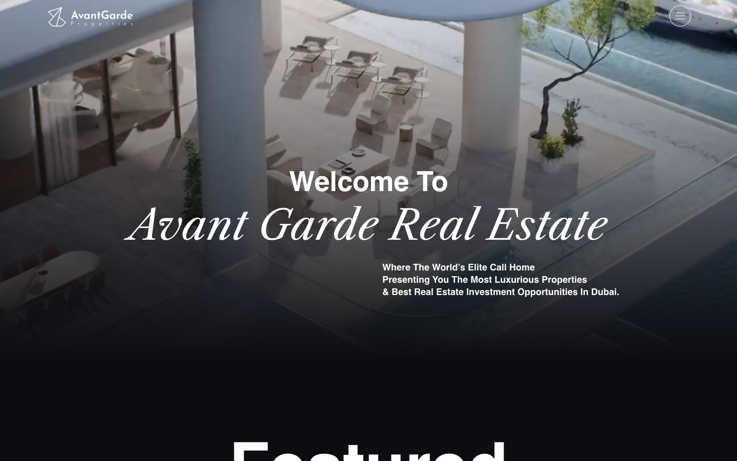
www.avantgarde-properties.com/A Dubai luxury real-estate agency that sells status boldly - a near-black canvas, an enormous mixed bold-sans-and-italic-serif display ("Welcome To / Avant Garde Real Estate"), full-bleed property films, a developer-partner logo wall (EMAAR, DAMAC, Nakheel), and copy aimed squarely at "the world's elite".
Design tokens
- display
- Playfair Display SC (italic) + bespoke 'ZD ZD' / 'ZDZD 2'
- body
- Manrope
- mono
Do / Don't
Reference it for
- Bold prestige-and-desire architecture for high-end real estate: a giant type-on-black hero, full-bleed featured-property films, and a developer-partner logo wall as credibility.
- A huge mixed-type display (heavy sans + large italic serif) on a near-black canvas as a confident, editorial luxury statement.
- A "Featured" bands pattern: named developments with full-bleed films/photos and prices, presented like a magazine of trophies.
- A partner/developer logo wall (marquee-proof) that borrows the prestige of recognisable names (EMAAR, DAMAC, Nakheel) as proof of access.
- A dark luxury palette (near-black + a single magenta/pink accent + gold/tan) for a bold, expensive feel.
Do not copy
- The exact near-black + magenta #cc3366 + gold #e2bf95 palette, the AvantGarde wordmark and the bespoke "ZD ZD" / Playfair Display SC type (re-skin and substitute fonts).
- The partner logos, the real developments (Asora Bay, Como) and prices, and the Dubai/elite copy - these are AvantGarde's real assets/positioning. A rebuild uses the client's own.
- The WordPress/Elementor + Swiper DOM. Rebuild lean on Astro.
Signature moves
giant mixed-type-on-black hero
the hero is pure oversized type on a near-black canvas - a heavy geometric sans ('Welcome To') over a large italic Playfair Display SC serif ('Avant Garde Real Estate') up to 112px - with the elite-facing tagline, so the type and the black ARE the hero, stating prestige boldly.
trophy property film bands
featured developments are shown as full-bleed autoplaying films with the name and AED price overlaid - a curated magazine of a few trophies rather than an MLS listings grid - which is what a luxury buyer responds to.
premier-partner logo wall as access proof
an 'Our Partners' wall of recognisable developer logos (EMAAR, DAMAC, Nakheel, Omniyat, Meraas) borrows the prestige of premier names as proof of access and credibility for a luxury agency.
Related references

Toll Brothers
flagshipOther
America's luxury homebuilder selling aspiration at scale - a Domaine serif over Gotham, a "Your New Home Starts Here" community-search configurator, Designer Appointed Collections, and an Apple Maps community finder, all in a restrained navy-and-tan system that makes a production builder feel bespoke and desirable.

Tranch
strongFintech
The reference for B2B fintech that refuses to look like B2B fintech - sketchbook-style asymmetric-radius cards, hand-drawn cartoon illustrations, pure black borders on white.

Alternative Aesthetics
nicheDesign Portfolio
The reference for solo illustrator portfolios on Webflow - hand-drawn "Stay Strange" hero typography, monochrome black/white canvas, and a 4-column thumbnail grid that lets the artwork carry the entire visual voice.

Analogue
strongCreative Studio
a "seriously playful" brand-and-motion studio that wears its personality as type, a wonky multi-alternate ANALOGUE wordmark, emoji and icon glyphs set inline in the copy, a candy-pink accent on white, and a GSAP-driven box of tricks (mexican-wave letters, glitches, bounce, float) kept just on the right side of chaos.