Side Brokerage
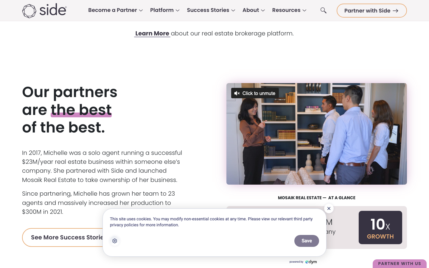
www.side.com/a real estate brokerage platform that reads like a confident B2B SaaS site: Poppins throughout, a plum-grey ink (#373342) with a plum-pink primary (#CE87C1) and a rust-red highlight, documentary agent photography and big "Own Your Future" display type.
Design tokens
- display
- Poppins (600/700)
- body
- Poppins (300/400/500)
- mono
- none
Do / Don't
Reference it for
- Warm, human B2B SaaS styling: Poppins, real documentary photography, soft plum accents instead of cold corporate blue.
- Using a single sharp highlight colour (rust-red) to underline and emphasise key phrases in long-form copy.
- A long-form, story-driven marketing page (personas, proof, pillars) that stays clean and scannable.
- Pill buttons (50px) on a 5px-radius base, a tidy two-tier radius system.
Do not copy
- The plum-pink + plum-grey palette and the Side wordmark are brand identity; borrow the soft-accent-plus-one-highlight structure, choose the client's own hues.
- It is a WordPress/Bootstrap stack with heavy third-party scripts (HubSpot, Vidyard, ad pixels); rebuild lean on Astro rather than porting the plugin weight.
- "Own Your Future" and the agent-ownership framing are Side's positioning; reuse the warm B2B approach, not the messaging.
Signature moves
warm-human B2B SaaS styling
Poppins throughout with documentary agent photography and soft plum accents replaces cold corporate blue, on a white page with a plum-grey ink
single-highlight emphasis in long-form copy
one sharp rust-red highlight underlines and emphasises key phrases inside long-form story-driven copy (personas, proof, pillars) that stays clean and scannable
two-tier radius pill system
pill buttons at 50px sit on a 5px-radius base, a tidy two-tier radius system (base 5px, pill 50px, with md 8px / lg 10px steps)
Related references

Mccarthy Building Companies
flagshipOther
A 100+ year, employee-owned national commercial builder that projects quiet authority at scale - full-bleed video and aerial photography of real megaprojects, oversized condensed type ("SUPERIOR RESULTS", "WE CAN BUILD IT"), a single bold red accent, and clip-path scroll reveals that feel cinematic but never showy.

Soscale
nicheCreative Studio
The reference for Swedish performance-marketing agencies that lead with creative rather than media-buying - pure-black canvas, oversized SOSCALE wordmark hero, lavender pill CTA, and a Webflow + GSAP + Lenis motion stack borrowed wholesale from the global studio scene.

Supersolid
nicheCreative Studio
The reference for Sydney creative-agency portfolios - near-black canvas, single-headline hero with a tiny "Scroll to explore" indicator, then a tile-grid case study reel and a chromatic-aberration ROIdeas display moment.

Abhishek Jha
nicheDesign Portfolio
Indian designer personal portfolio - 4-font system (DM Sans + thunder + editorial + playground), 17-step scale up to 288px, dark plum + pink palette, 9-keyframe marquee/cloud motion.