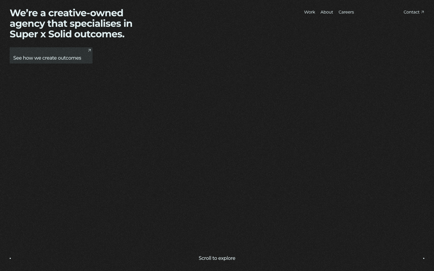
Supersolid
www.supersolid.agencyThe reference for Sydney creative-agency portfolios - near-black canvas, single-headline hero with a tiny "Scroll to explore" indicator, then a tile-grid case study reel and a chromatic-aberration ROIdeas display moment.
Design tokens
- display
- Joyride Ext, Joyride Alt, Impact, sans-serif
- body
- Montserrat, Arial, sans-serif
- mono
- Sono, Arial, sans-serif
Do / Don't
Reference it for
- Near-black rgb(28, 28, 28) page with rgb(45, 51, 52) secondary surface, not pure black
- Light-cyan body text rgb(234, 249, 251) (--swatch--light), distinctive away from pure white
- Mid-grey muted text rgb(162, 176, 178) (--swatch--light-dark) for de-emphasised copy
- Three brand accents reserved for one moment: magenta #ea33f7, cyan #75fbfd, lime #f1fe67
- Chromatic-aberration RGB-split treatment on the closing CTA wordmark (final scroll)
- Two-family typography: Montserrat Bold/Medium for content + Sono Regular for system labels
- Joyride EXT / Joyride ALT custom display fonts reserved for chromatic-aberration moments
- 8-step px type ladder (14, 16, 20, 24, 32, 48, 64, 76.8) all wrapped in fluid clamp()
Do not copy
- The "Supersolid" / "Super x Solid" / "ROIdeas®" naming (trademarked)
- The Joyride EXT / Joyride ALT custom display fonts (commissioned)
- The exact magenta/cyan/lime brand triplet (#ea33f7 / #75fbfd / #f1fe67)
- The TikTok / ATO (myID) / Hyatt / JCDecaux case studies
- The Sydney creative-owned agency positioning unless the brand is comparable
- The "We're a creative-owned agency..." hero copy
- The "(11)" project-count braggadocio unless the brand actually has the inventory
- The Three.js dependency unless there is a real 3D moment to justify the 600kb cost
Signature moves
stepped near-black surface system
a near-black rgb(28,28,28) page with rgb(45,51,52) secondary surface, light-cyan body rgb(234,249,251) and mid-grey muted rgb(162,176,178), avoiding pure black and pure white.
chromatic-aberration payoff wordmark
the three brand accents (magenta/cyan/lime) and the custom display face are reserved for one closing RGB-split treatment on the CTA wordmark at the final scroll.
staggered video-tile case grid
a two-column staggered tile grid presents works as video case studies, each with a tiny client-label-over-campaign-name caption and a top-right category badge.
Related references

Mccarthy Building Companies
flagshipOther
A 100+ year, employee-owned national commercial builder that projects quiet authority at scale - full-bleed video and aerial photography of real megaprojects, oversized condensed type ("SUPERIOR RESULTS", "WE CAN BUILD IT"), a single bold red accent, and clip-path scroll reveals that feel cinematic but never showy.

Abhishek Jha
nicheDesign Portfolio
Indian designer personal portfolio - 4-font system (DM Sans + thunder + editorial + playground), 17-step scale up to 288px, dark plum + pink palette, 9-keyframe marquee/cloud motion.

Alejandro Mejias
nicheDesign Portfolio
A Melbourne solo UX designer's Framer-built portfolio in a brutalist bracket-wrapped monospace voice - black-on-white chrome punctuated by a single neon-yellow accent, dotted-grid hero, and full-bleed yellow about page.

Analogue
strongCreative Studio
a "seriously playful" brand-and-motion studio that wears its personality as type, a wonky multi-alternate ANALOGUE wordmark, emoji and icon glyphs set inline in the copy, a candy-pink accent on white, and a GSAP-driven box of tricks (mexican-wave letters, glitches, bounce, float) kept just on the right side of chaos.