Posthog
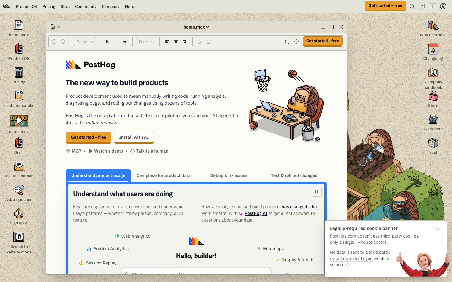
posthog.compersonality as the strategy - a warm, cream-toned developer-analytics site that leans hard into a hedgehog mascot, playful animation and quirky copy to feel human in a sterile category.
Design tokens
- display
- IBM Plex Sans (Variable)
- body
- IBM Plex Sans
- mono
- Source Code Pro
Do / Don't
Reference it for
- Differentiating a sterile category through warmth and personality.
- A warm cream/tan palette as an alternative to default cool greys.
- A recurring mascot and playful keyframe animation used as brand identity.
- Quirky, characterful copy and navigation that signal a human team.
Do not copy
- The hedgehog mascot and the specific cream palette - wholly PostHog-coded.
- The quirky nav (file extensions, "Trash") - it is PostHog's joke; a client needs their own.
- Personality must be earned by a genuine brand voice - bolting on whimsy reads as fake.
Signature moves
warm cream palette against a sterile category
a warm cream/tan surface (#eeefe9) with an orange accent (#f54e00) replaces the default cool greys of developer-analytics, differentiating through warmth.
recurring mascot plus playful keyframe animation
a recurring mascot and playful CSS keyframe animation (43 @keyframes, ~150ms transitions) act as brand identity, with quirky characterful copy and nav signalling a human team.
Related references

Gumroad
strongMarketing Platform
The reference for playful creator-platform branding - chunky black filled CTAs, cream background, hand-drawn pink coin illustrations, ABC Favorit at 96px.

Huge
flagshipCreative Studio
a black-canvas, Monument-Grotesk agency site that turns brutalist restraint into confidence, sharp corners, one type family, vast empty space, then detonates a few hot-pink and acid-green colour blocks and lets Lenis-smooth scroll reveal the work.

Koto
strongCreative Studio
The reference for global brand-agency studios - yellow logomark on near-black, four custom typefaces, live UTC clock chrome, split-screen sticky-text case study reveals.

Mercury
flagshipFintech
a banking site that turns scale and aspiration into the brand - bespoke variable Arcadia/ArcadiaDisplay typography at intermediate weights (420/480), a glass-blur dark nav over a 1952px-wide light page, atmospheric mountain/space photography, and one electric-indigo CTA in a sea of refined neutrals.