Mercury
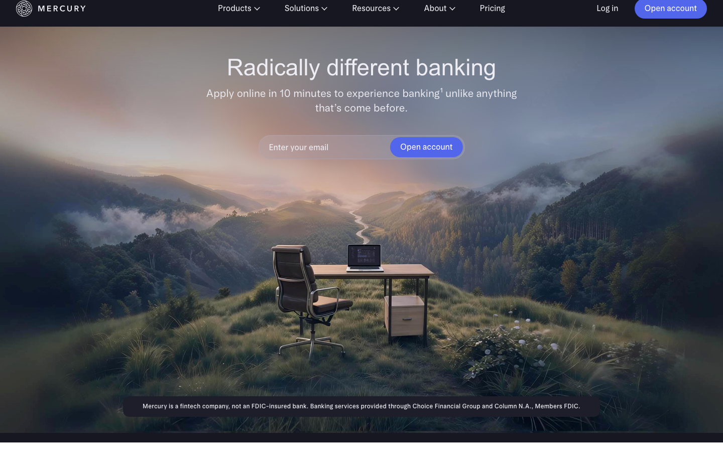
mercury.coma banking site that turns scale and aspiration into the brand - bespoke variable Arcadia/ArcadiaDisplay typography at intermediate weights (420/480), a glass-blur dark nav over a 1952px-wide light page, atmospheric mountain/space photography, and one electric-indigo CTA in a sea of refined neutrals.
Design tokens
- display
- arcadiaDisplay, "arcadiaDisplay Fallback"
- body
- arcadia, "arcadia Fallback"
- system
- ui-sans-serif, system-ui, sans-serif, "Apple Color Emoji", "Segoe UI Emoji", "Segoe UI Symbol", "Noto Color Emoji"
Do / Don't
Reference it for
- The bespoke arcadia + arcadiaDisplay variable-font system at intermediate weights (420/480 dominant). Reads as confident-without-being-bold - perfect for a category (banking, fintech) that needs to convey both authority and warmth.
- A 1952px outer content cap on the page, with content nested in 608/1024/1320/1376px secondary columns. Lets the page accommodate edge-to-edge full-bleed imagery without sacrificing reading width.
- Glass-blur dark nav (background-color: rgb(23,23,33), backdrop-filter: blur(10px), transition 0.5s cubic-bezier(0,0,0.6,1)) over a mostly-light page. Mode-flip executed in the nav rather than in a section.
- A three-easing × three-duration motion contract: 0.15s tailwind-default for hover, 0.3s ease-out for opacity/surface, 0.5s slow-ease for nav/header. Each easing has a single job.
- Pill-radius buttons at 40px (21 hits) - larger than Cursor's max-pill, gives the CTA more visual weight. Primary in electric indigo (Open account), secondary as outline-link in nav.
- Asymmetric input-button pair (32px / 0 / 0 / 32px on the input + 40px pill on the button) for the inline-CTA email pattern. The split-radius makes the input and button read as one composite control.
- Aspirational photography in the hero - Mercury uses landscape/sky/mountain imagery (atmospheric, abstract, low-key) rather than product screenshots. The photograph IS the brand position: "your business, in the wild."
- A deep section count (13 in main) with strong rhythmic confidence - "$650M in annual revenue and profitable" as a section title is a flex move worth understanding in isolation.
Do not copy
- arcadia / arcadiaDisplay - bespoke to Mercury, not licensable. Substitute the client's own variable sans (Inter, Söhne, Helvetica Now Variable).
- The intermediate weight values (420, 480) cannot be hit on a non-variable font; if the client's face is static-weight, you'll have to settle for 400 and 500 and lose some of the optical tuning.
- The Mercury indigo #5e72e4-ish CTA colour - strongly Mercury-coded by now. Pick the client's own primary.
- A 1952px outer cap on text-led content brands - too wide; the reading width breaks. The wide cap only works because Mercury's content alternates between full-bleed imagery and inner-column text.
- The 86-script + dozen-analytics-pixel network bill (Segment + Taboola + Bing + Google + Reddit + Facebook + DoubleClick + Rockerbox). Most clients should ship 5-15 scripts total.
- The "300K+ ambitious entrepreneurs" and "$650M revenue" claims as a tone - only land for brands that have the genuine numbers to flex.
- Backdrop-filter blur on the nav if the client's brand has light/cream sections directly under the nav - the blur smudges colour-bands; it works on Mercury because the page sections are visually distinct.
Signature moves
intermediate-weight variable type system
a bespoke variable display/text system run at intermediate weights (420/480 dominant) that reads confident-without-being-bold, suited to authority-plus-warmth categories.
wide outer cap with nested reading columns
a 1952px outer content cap with content nested in 608/1024/1320/1376px secondary columns, accommodating edge-to-edge imagery without breaking reading width.
three-easing three-duration motion contract
each easing has one job: 0.15s tailwind-default for hover, 0.3s ease-out-soft (cubic-bezier(0,0,0.2,1)) for opacity/surface, 0.5s ease-out-slow (cubic-bezier(0,0,0.6,1)) for the glass-blur dark nav.
Related references

Adaline
strongDeveloper Tool
an AI-infra product site that swaps the genre's default dark-neon for a hand-built 3D Japanese-garden world, then runs warm earth tones, a grotesque/mono type pair and patient scroll-reveal motion over the top so a developer tool feels like a calm place.

Analogue
strongCreative Studio
a "seriously playful" brand-and-motion studio that wears its personality as type, a wonky multi-alternate ANALOGUE wordmark, emoji and icon glyphs set inline in the copy, a candy-pink accent on white, and a GSAP-driven box of tricks (mexican-wave letters, glitches, bounce, float) kept just on the right side of chaos.

Bench Accounting
strongProfessional Services
a small-business bookkeeping service that builds trust with a deep-navy hero, friendly Circular Std type, a soft blue-teal palette and a product mock-up showing real reports and chat support, calm, credible, conversion-focused.

Decodable
strongData Infrastructure
The reference for B2B data-infrastructure: dark navy hero with rainbow data-flow visualization, Inter at four weights, bright Anthropic-blue CTAs over deep `#0e0f18`.