Merouane Bali
merodev.neta developer-designer's portfolio that opens on a pure-black void with a single pixel-font "Enter" button, gating the experience behind a deliberate retro-terminal threshold and a cyan-tinted, Tailwind-built world beyond it.
Design tokens
- display
- Iceland
- body
- Reckoner
- mono
- Iceland (pixel/arcade feel)
Do / Don't
Reference it for
- The deliberate entry gate: a pure-black void with one pixel-font "Enter" button as a confident, game-start threshold before content.
- Retro-terminal / arcade aesthetic done cleanly: blocky display type (Iceland), hairline outlines, no shadow, no rounding.
- A cyan glow accent (#00FFFF) used sparingly as translucent fills against pure black.
- A character-display-led type system (Iceland, Big Shoulders Display, Reckoner) instead of a neutral grotesque.
- A lean, Tailwind-plus-Cloudflare build with a ready set of utility @keyframes (bounce, shake, slide, spin) for the gated experience.
Do not copy
- The black-void "Enter" gate is a strong personality move that suits a maker showing confidence; on a client whose users need fast access to information, a hard gate hurts conversion.
- The pixel/arcade Iceland face is a brand-defining choice; borrow the threshold idea, not necessarily the retro font.
- The cyan-on-black glow is brand-coded retro-terminal; map it to the client's accent if the retro register does not fit.
Signature moves
black-void entry gate
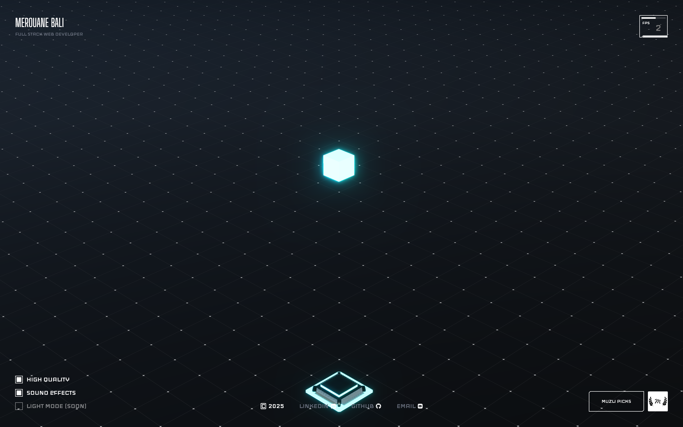
a pure-black void with a single pixel-font Enter button gates the experience behind a deliberate, game-start threshold before any content.
clean retro-terminal aesthetic
a retro-terminal/arcade register done cleanly: blocky display type (Iceland), hairline outlines, no shadow and no rounding (radius 0px), with a sparing cyan glow (#00FFFF) as translucent fills.
Related references

Gianluca Gradogna
nicheDesign Portfolio
a multidisciplinary designer's portfolio that floats a crisp white intro card over a dark, full-bleed photographic world, pairing a clean Neue Montreal grotesque with a high-contrast Times display serif and one slow in-out-sine colour fade.

Hugo Baron
nicheDesign Portfolio
The reference for solo motion-design portfolios that lean on a single brand colour, a giant condensed display face, and a "loading-screen-as-hero" gimmick to read as confident and craft-forward without an agency budget.

Jens Bosman
nicheFilm Production
The reference for solo motion-director portfolios - pure black canvas with monumental Helvetica display type, pill-shaped chip nav, and a single sticky "W." / vertical "Honors" chrome mark.

Lanserring
flagshipTrades
a bespoke-joinery house that sells craft as heritage, warm sepia interiors and meadow photography under a high-contrast transitional serif, the brand reduced to a single fine line-drawn ring, with quiet WordPress structure and almost no visible motion furniture.