Gianluca Gradogna
gianlucagradogna.coma multidisciplinary designer's portfolio that floats a crisp white intro card over a dark, full-bleed photographic world, pairing a clean Neue Montreal grotesque with a high-contrast Times display serif and one slow in-out-sine colour fade.
Design tokens
- display
- Times
- body
- Neue Montreal
- mono
- none
Do / Don't
Reference it for
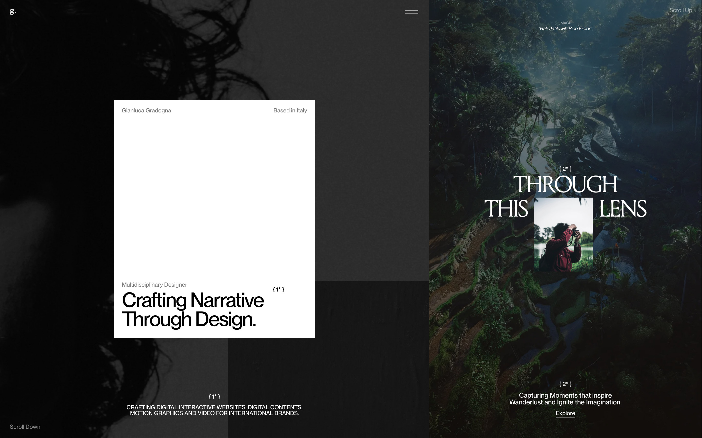
- The white-card-over-dark-world device: a clean content card laid over full-bleed photographic panels, like a print sample placed on a dark desk.
- Grotesque-plus-Times pairing: Neue Montreal for structure and labels, Times as a borrowed-classic display serif for editorial headlines.
- Editorial footnote markers ({ 1* }, { 2* }, "Scroll Down" / "Scroll Up") used as wayfinding and texture.
- Restraint as a signature: one slow in-out-sine colour fade and almost no chrome, letting imagery and type carry the page.
Do not copy
- The portrait and travel photography are the designer's own work; borrow the framing device, not the images.
- The single white card holding the intro is a one-off composition; it works because the surrounding world is dark and quiet, so do not bolt it onto a busy page.
- Times as a display face is a deliberate "default serif" wink from a designer; on a client brand, map it to an intentional display serif instead.
Signature moves
white-card-over-dark-photographic-world device
a crisp white intro card floats over a dark full-bleed photographic world, like a print sample placed on a dark desk, in a split-panel composition with a centred ~400-460px card.
grotesque-plus-Times pairing with footnote-marker wayfinding
Neue Montreal for structure and labels plus Times as a borrowed-classic display serif at 152px, with editorial footnote markers ({ 1* }, { 2* }, 'Scroll Down'/'Scroll Up') as wayfinding and texture.
Related references

Clay Boan
nicheDesign Portfolio
A one-screen portfolio reduced to a single fragmented blackletter wordmark on near-pure-black, where the only "design" on the canvas is a piece of broken display typography that morphs as you scroll.

Hugo Baron
nicheDesign Portfolio
The reference for solo motion-design portfolios that lean on a single brand colour, a giant condensed display face, and a "loading-screen-as-hero" gimmick to read as confident and craft-forward without an agency budget.

Jens Bosman
nicheFilm Production
The reference for solo motion-director portfolios - pure black canvas with monumental Helvetica display type, pill-shaped chip nav, and a single sticky "W." / vertical "Honors" chrome mark.

Lanserring
flagshipTrades
a bespoke-joinery house that sells craft as heritage, warm sepia interiors and meadow photography under a high-contrast transitional serif, the brand reduced to a single fine line-drawn ring, with quiet WordPress structure and almost no visible motion furniture.