Noma
noma.dk/a three-Michelin-star restaurant that sells itself through photography and a quiet serif, full-bleed seasonal imagery, a lowercase joined wordmark, and almost no chrome, so the food and the place carry the whole page.
Design tokens
- display
- Reckless-Neue (display serif, weights 400/500)
- body
- Reckless (serif body, weights 400/600/700)
- sans
- Roobert (buttons, weight 500)
- label
- GT Pressura and GT Pressura Mono (labels)
- mono
- GT Pressura Mono
Do / Don't
Reference it for
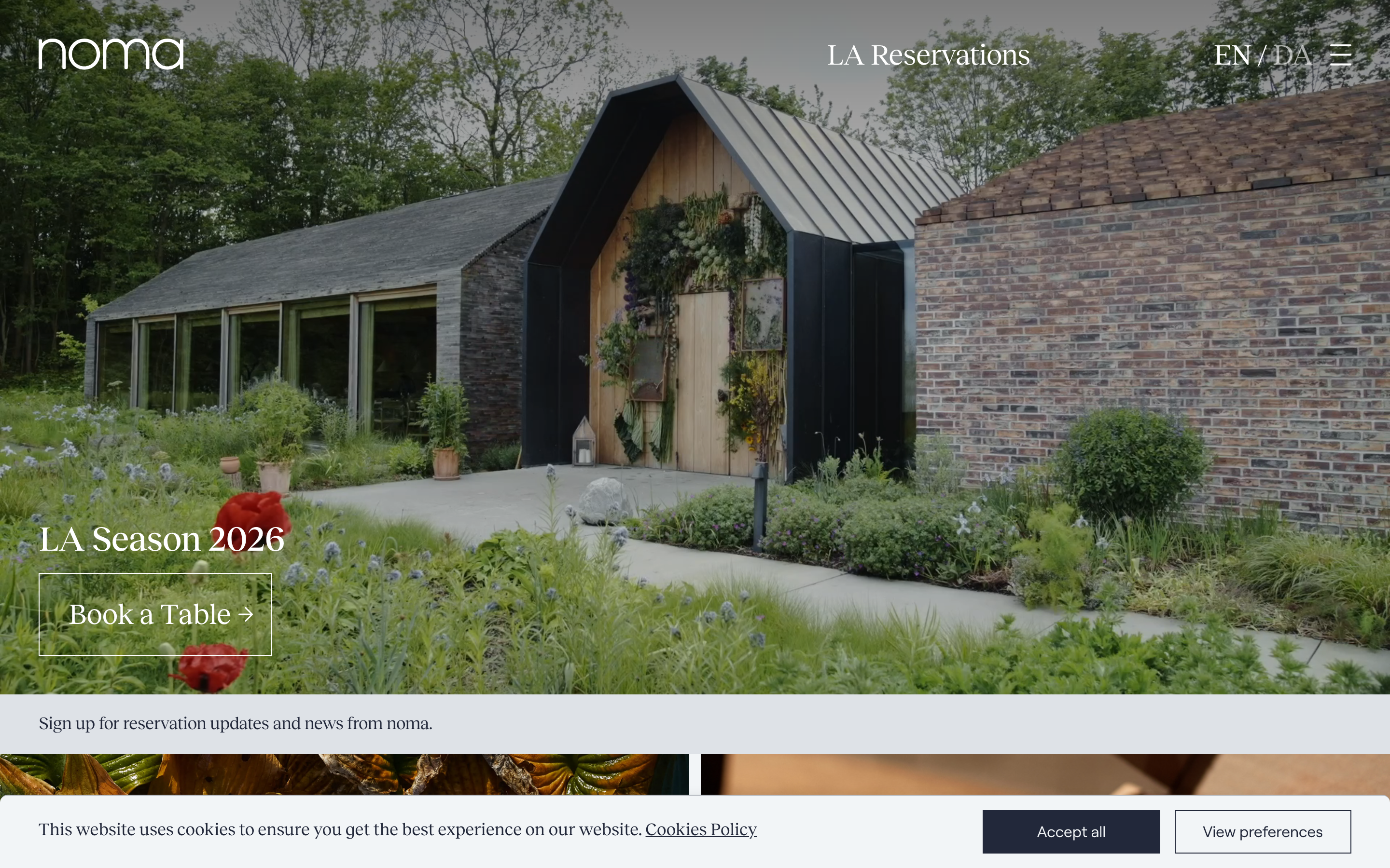
- Photography-as-hero: a single full-bleed seasonal image with a thin-outline CTA and nothing competing with it.
- A warm editorial serif for the entire voice, including a custom lowercase wordmark, on a hospitality site.
- Putting booking and the reservation-newsletter high, treating the table as the scarce product.
- A stack of full-width photographic panels (each a venture or season) as the body, captioned not cluttered.
- Near-monochrome restraint: near-black ink on white and on imagery, no decorative colour.
Do not copy
- The lowercase joined "noma" wordmark is the restaurant's identity; build the client's own mark, do not imitate it.
- Near-zero chrome only works when the photography is genuinely world-class; weaker images need more structure, not less.
- The flagship's "we need no explanation" confidence suits an institution; a new venue still has to say what it is and why.
Signature moves
photography-as-hero with thin-outline CTA
a single full-bleed seasonal image with only a thin-outline CTA and nothing competing, followed by a stack of full-width photographic panels captioned not cluttered.
warm-serif editorial voice + booking-forward chrome
a warm editorial serif (Reckless / Reckless-Neue) carries the entire voice including a lowercase wordmark, with booking and the reservation newsletter placed high, treating the table as the scarce product, on near-monochrome ink-on-white.
Related references

Frenchie Restaurant
strongHospitality
a Paris restaurant group telling a family story, a dark moody hero of textured produce stills, a Traulha display serif (roman and italic) over a Gill Sans body, cream type on near-black ink, and a calm row of venue cards that turns six establishments into one elegant front door.

Murdock London
flagshipBeauty
a heritage British barbershop and grooming brand run as a polished Shopify storefront, deep ink-navy on warm off-white, Montserrat throughout, a hand-script accent for warmth, and a calm 0.3s ease-in-out motion language that keeps the commerce furniture quiet.

Barrys
flagshipFitness
the original HIIT studio brand selling "the best workout in the world", a dark, cinematic Webflow site built on near-black and the Red Room red, condensed athletic display type, a hand-painted script signature, and a booking-first hero that puts "find a studio" above everything.

Core Atelier Pilates
nicheFitness
a warm, editorial pilates-studio site in espresso and cream (#25140C / #F7E7DE) with an Albert Sans plus Minion Pro serif-italic pairing, sun-lit interior photography, Lenis-smoothed scrolling and a giant "core atelier" wordmark closing the page.