Lalo
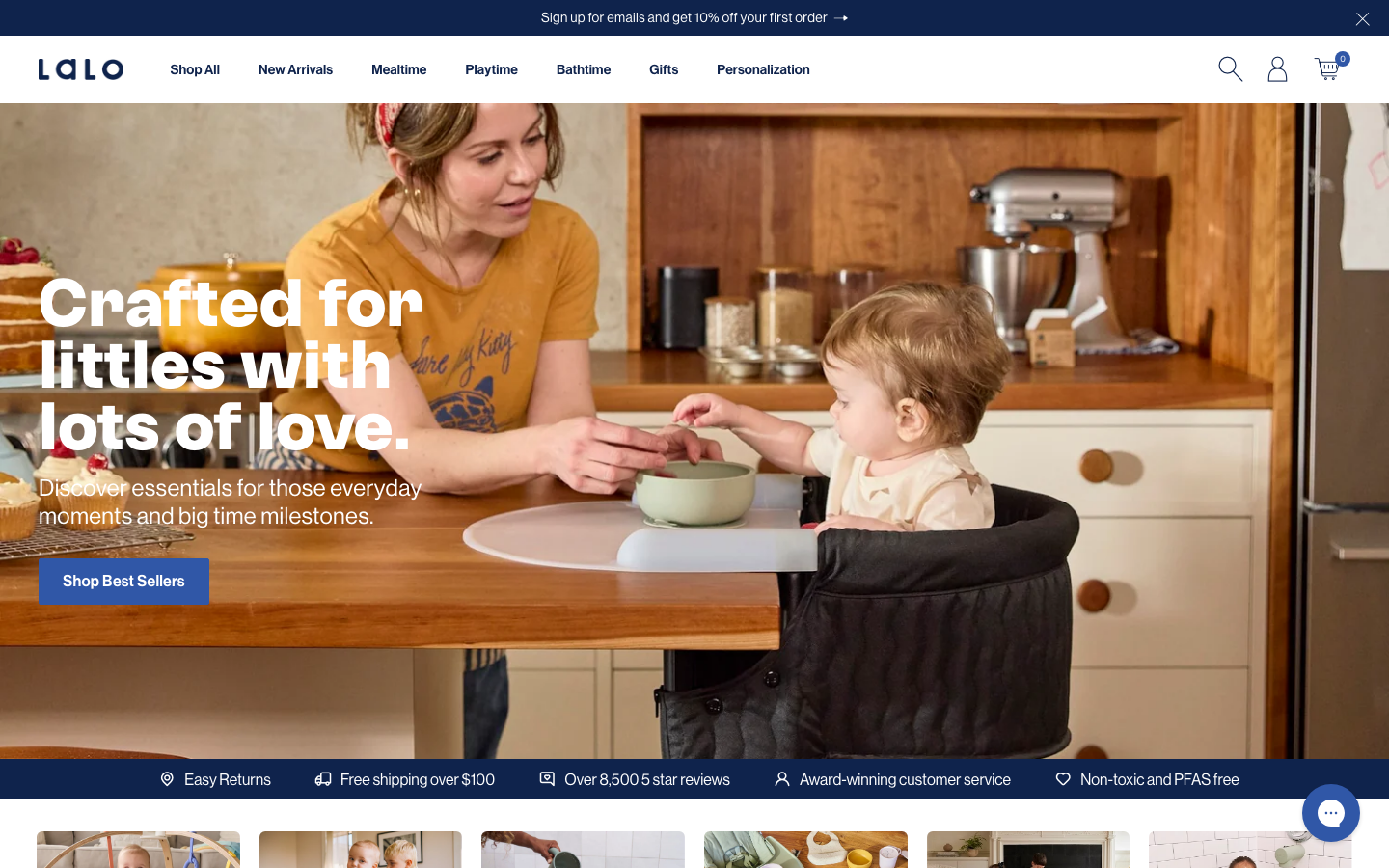
www.meetlalo.com/a baby-and-toddler products store on Shopify that reads as premium rather than cutesy, deep navy (#0F234C) on white, a GT Alpina serif paired with Neue Haas Grotesk, warm real-family kitchen photography, full navy feature panels with a warm CTA, and GSAP-plus-Swiper product carousels.
Design tokens
- display
- GT Alpina
- body
- NeueHaasGrotDisp
- mono
- none
Do / Don't
Reference it for
- A premium baby/family palette: deep navy (#0F234C) as the lead colour on white, with a single warm CTA, no pastels.
- GT Alpina serif headlines over Neue Haas Grotesk body, warmth and credibility without childishness.
- Full-bleed navy feature panels (e.g. "Why Stainless Steel?") that chapter a product page and host a contrasting CTA.
- Warm, candid real-family lifestyle photography as the emotional core.
- Product carousels with colour-swatch variants (Swiper) and an Instagram follow-along marquee for social proof.
Do not copy
- The full marketing-script and app stack (Klaviyo, Fondue, Paloma, TikTok, Toki and more) is conversion machinery, not craft; it bloats the page to 600+ requests.
- Lalo's exact navy-and-serif identity is theirs; keep the premium logic, map the palette to the client.
- Shopify's default carousel/section sprawl should be trimmed, not reproduced, on a lighter build.
Signature moves
full-bleed navy feature panels with warm CTA
full-bleed deep-navy (#0F234C) feature panels chapter a product page (e.g. "Why Stainless Steel?") and host a single contrasting warm CTA against the white default ground
premium serif-over-grotesque family pairing
GT Alpina serif headlines sit over Neue Haas Grotesk body to read premium and credible rather than childish, on a navy-on-white base with no pastels
swatch-variant product carousel with social marquee
Swiper product carousels carry colour-swatch variants and an Instagram follow-along marquee runs as social proof, with GSAP ScrollTrigger reveals
Related references

Bellroy
flagshipRetail
an accessories e-commerce site that fronts a deep catalogue with one bold, punchy hero, leading with heavy uppercase GTUltra type, a warm terracotta accent on a near-monochrome base, and a calm Material-style motion system that keeps a 40-section shop feeling composed.

Cubitts
nicheHealth
a London bespoke-spectacle maker treating its Shopify storefront like a design museum, near-black ink on white, a tiny precise type scale in its own Fold Grotesque, generous 16px-radius media tiles, and a giant "CUBITTS" wordmark laid behind a Greenwich Observatory photograph.

Erewhon
strongRetail
a cult premium grocer that turned organic groceries into a lifestyle brand, a warm off-white canvas, confident Sharp Sans, a category-led shop, and a strong mission-and-community story that justifies the premium.

Jardan
strongRetail
an Australian designer-furniture and homewares house whose homepage opens on a warm, cinematic golden-hour video of hands working raw timber and a rug being woven, set in a strictly greyscale, whitespace-led editorial system with the Neuzeit Grotesk sans doing nearly all the work and a BN Cicero serif for accents.