Drexler
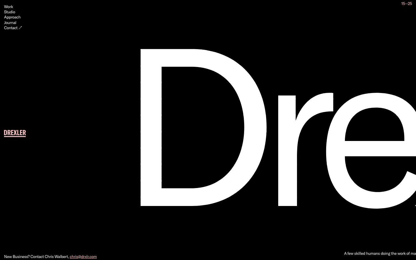
drxlr.comA Baltimore studio that uses a single 765px-tall wordmark as the entire homepage, with a warm pink-on-black palette and 5-link nav, signalling small-shop confidence through wordmark-as-canvas restraint.
Design tokens
- display
- body
- mono
Do / Don't
Reference it for
- Wordmark-as-homepage - H1 at 765px GT America weight 100, scrolling horizontally as content
- Pure black #000000 page with warm pink #FFC7C7 foreground accent and white body
- Five-item left-aligned vertical nav (Work / Studio / Approach / Journal / Contact) at top-left
- Persistent mid-edge wordmark ("DREXLER" pinned in pink) as logo while scrolling
- Year-range top-right indicator ("15, 25") signalling studio age without "Est." or "Since" copy
- Bottom-edge contact line ("New Business? Contact Chris Walbert, chris@drxlr.com")
- Bottom-edge tagline ("A few skilled humans doing the work of many") right-aligned
- GT America Regular at weight 100 for monumental display type - ultra-thin geometric sans
Do not copy
- The GT America font commission (Grilli Type-licensed, used by Koto too - both pay foundry fees)
- The exact #FFC7C7 warm pink unless the brand calls for warm-pink positioning
- The "Drexler" wordmark text or "drxlr" abbreviation
- The "A few skilled humans doing the work of many" tagline copy
- The Baltimore HQ address and Chris Walbert contact details
- The @drxlr Instagram / /drexler LinkedIn handles
- The 410 phone area code unless the brand is Maryland-based
- The 765px wordmark literally on every page - works as homepage thesis statement, not on inner pages
Signature moves
wordmark-as-homepage pinned across scroll
a single ~765px GT-America-weight-100 wordmark is the entire homepage, pinned mid-edge and scrolling horizontally as content across ~2520px of scroll.
edge-anchored studio chrome
a five-item top-left vertical nav, a top-right year-range indicator ('15-25'), and bottom-edge contact and tagline lines frame the page without 'Est.'/'Since' copy.
Related references

Analogue
strongCreative Studio
a "seriously playful" brand-and-motion studio that wears its personality as type, a wonky multi-alternate ANALOGUE wordmark, emoji and icon glyphs set inline in the copy, a candy-pink accent on white, and a GSAP-driven box of tricks (mexican-wave letters, glitches, bounce, float) kept just on the right side of chaos.

Cyphr
strongCreative Studio
The reference for venture-studio portfolios that flex through monumental condensed type, a single blue I-beam cursor accent, and a venetian-blind slat hero that fragments a single image into a column-rhythmic curtain.

General Condition
nicheCreative Studio
Self-aware "this might be a design studio" hero on near-black with vivid red display + rainbow-bordered chrome - WordPress+Elementor post-modern creative aesthetic.

Lanserring
flagshipTrades
a bespoke-joinery house that sells craft as heritage, warm sepia interiors and meadow photography under a high-contrast transitional serif, the brand reduced to a single fine line-drawn ring, with quiet WordPress structure and almost no visible motion furniture.