Coco Republic
www.cocorepublic.com.au/An Australian luxury furniture and interior-design house that fuses editorial aspiration with e-commerce - a calm near-white canvas, a Goldenbook serif over Moderat sans, full-bleed styled-room photography, an "Inside Our Universe" editorial layer (journals, catalogues, design portfolios) and a "Shop Coco Republic" category grid, plus a full interior-design service.
Design tokens
- display
- Goldenbook (serif, with Aboreto)
- body
- Moderat
- mono
Do / Don't
Reference it for
- Editorial-commerce architecture for a luxury homewares/lifestyle brand: run the store like a design magazine - styled photography and an editorial layer wrap the product grid.
- An "Inside Our Universe" inspiration layer (journals, catalogues, design portfolios, showcase homes) that builds desire before the category grid.
- A retail-plus-high-touch-service model: an "add to cart" product grid sitting beside a full interior-design consultation offer.
- A serif (Goldenbook) for aspirational editorial headings over a clean grotesque (Moderat) for product/UI - magazine poise with retail clarity.
- A calm, warm luxury palette (near-black + white + pale grey + one deep heritage red) that lets styled-room photography lead.
- A flexible percentage-based product grid for a responsive, editorial catalogue.
Do not copy
- Goldenbook and Moderat are licensed - substitute analogues. The deep red #a92526 and the Coco Republic wordmark are identity; re-skin.
- The real products, the showcase homes, journals/catalogues and the design-service copy - these are Coco Republic's genuine assets. A rebuild uses the client's own.
- The BigCommerce + Klaviyo/Searchspring/Latitude/DoubleClick stack. Rebuild on the client's chosen commerce platform; keep it lean.
Signature moves
inside-our-universe editorial-before-shop
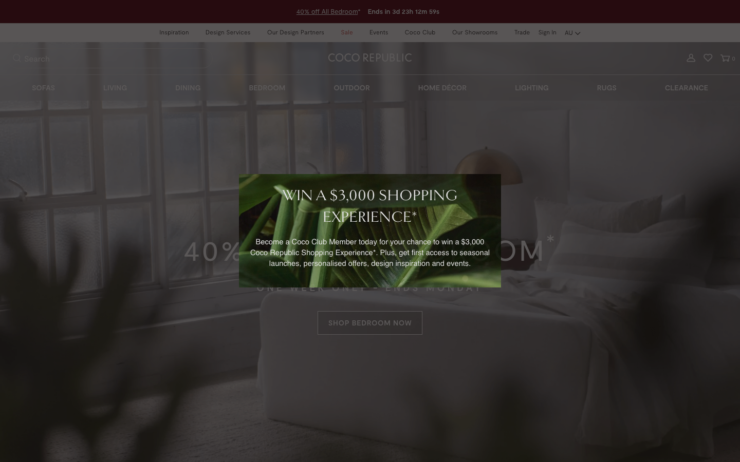
an 'Inside Our Universe' editorial layer (journals, catalogues, design portfolios, a named showcase home) sits between the styled hero and the product grid, building desire and lifestyle before any 'add to cart' - running the store like a design magazine.
shop-plus-design-service dual model
a self-serve product catalogue ('Shop Coco Republic') sits beside a high-touch interior-design offer (complimentary consultations, full-service design, 'Book Appointment'), so a buyer can purchase a piece or commission a designer from the same site - premium positioning through service.
serif-editorial / grotesque-retail luxury system
a refined display serif (Goldenbook, uppercase and letter-spaced) for aspirational headings over a clean Swiss grotesque (Moderat) for product names and prices, on a calm near-monochrome palette with one deep heritage red, makes a furniture store feel like a design publication.
Related references

Bellroy
flagshipRetail
an accessories e-commerce site that fronts a deep catalogue with one bold, punchy hero, leading with heavy uppercase GTUltra type, a warm terracotta accent on a near-monochrome base, and a calm Material-style motion system that keeps a 40-section shop feeling composed.

Cubitts
nicheHealth
a London bespoke-spectacle maker treating its Shopify storefront like a design museum, near-black ink on white, a tiny precise type scale in its own Fold Grotesque, generous 16px-radius media tiles, and a giant "CUBITTS" wordmark laid behind a Greenwich Observatory photograph.

Euro Design Remodel
strongOther
A Bay Area bathroom/kitchen design-remodel firm that earns trust through a wall of third-party proof - a star-rated testimonials carousel, a full badge row (Houzz, EPA Lead-Safe, BBB, Angie's List, Yelp), financing reassurance and a "100% satisfied" promise, all on a clean white-and-blue canvas.

Food52
strongRetail
a food-and-home brand that fused editorial content with commerce, recipes and stories draw you in, a clean serif-and-sans system on white, and a shop (cookware, gifts, homewares) is always one tap away.